Right product, right place, right time—it’s the lofty visual merchandising goal to which so many designers aspire. There are a lot of products competing for your customer’s attention. Effective retail merchandising involves creativity and good decision-making to fuel that first burst of purchasing desire. In order to keep customer attention long enough for a sale, retail displays need to blend eye-catching creative appeal with a sound visual merchandising strategy.
Read our guide to visual merchandising and start breathing new life into your retail displays.
1. Align Retail Displays with What Customers Want—Not What They Need
Ideally, your retail displays should always show your most popular products first. From here, you can surround them with less popular products to bolster additional sales. The idea is that your top sellers are always up front-physically and in front of customers’ minds.
Remember: Customers don’t react to impulse buys on products they need, but those they want. For this reason, you may want to put your utilitarian items in the background and showcase your flashier products upfront. Research shows that only 1/2 of all purchases made in-store are planned, so capitalizing on this can help drive more revenue. Additionally, you can pair related, complementary items(such as laptop cases or patio furniture with pool cleaning supplies) to upsell clients.
2. Create Memorable Experiences
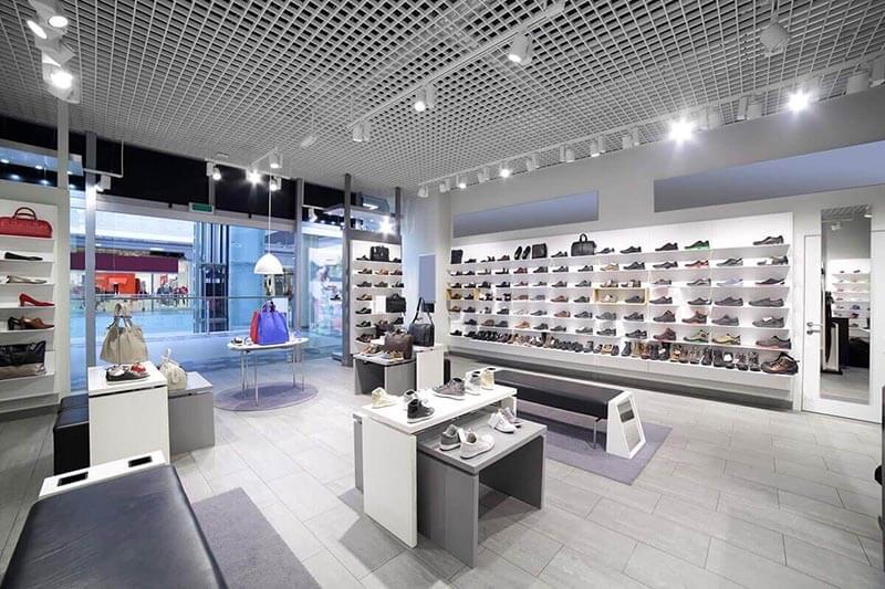
Consumers enter a brick-and-mortar store for an experience. By offering knowledgeable staff or creating a desirable environment, you can create an experience that shoppers can’t find online.
When Steve Jobs opened his first Apple store, he analyzed several boutiques and their store layout. He wanted to achieve a sense of luxury for the Apple brand, which was groundbreaking in the technology space. Upon investigating these brand-name clothing stores, he discovered a simplistic layout, showcasing only a few products in an airy environment. With the launch of their first retail locations, over 7,000 visitors entered their doors, driving almost $600,000 in sales. By focusing on the experience, Apple has become a leader in retail merchandising and store design.
[wbcr_snippet id=”734″]
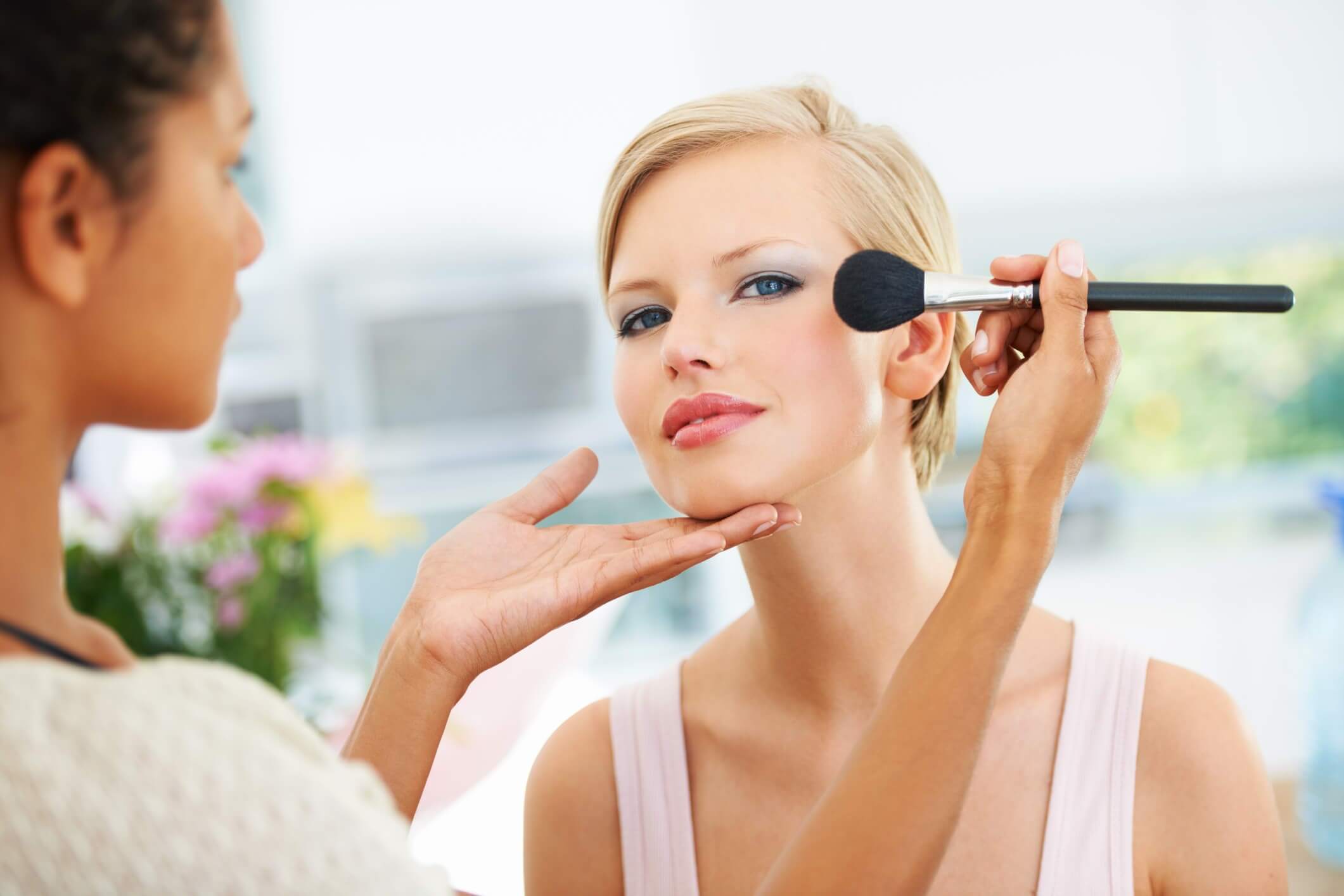
Additionally, stores like Sephora offer in-person services featuring hot products that can be seen through the storefront window, helping to drive foot traffic. At Sephora, sections are organized by category, end caps feature new products, and the signage is as bold as the makeup products themselves. Everything is organized in a manner to get the customer to walk around the store and try products.
3. Abide by the Rule of Threes
When it comes to putting your products on display, they should be set up across three different price tiers: expensive, affordable, and least expensive. The most expensive products should be the main focus, as these are the ones you want to fly off the shelves. Affordable and cheap products can help you sustain your bottom line, by acting as “add-on” products that customers ultimately choose to buy before checking out.
4. Tell a Story with Signs
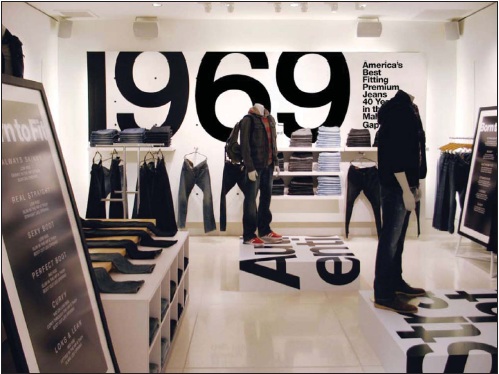
Signs are important visual merchandising display tools that help guide customers on their retail journey. But they are far more than informational pieces. One common visual merchandising technique involves using signs to tell a story. Signs that tell a story may highlight a piece of your company vision, history or philosophy. The “1969” in this photo, for example, could be the year the retailer opened or it could signify an era the brand cherishes.
Don’t be afraid to be bold with signage. With shortening attention spans as a result of digital devices, bright colors, abstract shapes, or props can help drive attention to your store. The design should also contain an element of simplicity. Don’t forget to include blank space on the sign for your viewer’s eyes to rest and to only highlight one key element.
5. Keep the Line of Sight in Mind
Some of us embrace the old thinking that you can’t sell the product if it’s in the stockroom. So, we stuff the floor with as much product as possible. This can lead to a lot of cluttered displays that lack focus and appeal.
There are many reasons to make your focal point at eye level. The average height for adult females is around 5’4″, while the average height of adult males is 5’9″. Retail display pedestals and pedestal risers can help you display your products at the ideal sightline for your target audience, whether it primarily consists of males or females.
Eye-level is also where you should place high priced and popular items. Shoppers look there first before making a decision. Research shows that shoppers generally make a decision about adding something to their cart within 8 seconds, which is why it is important to place the right products at eye level.
6. Create Dimension
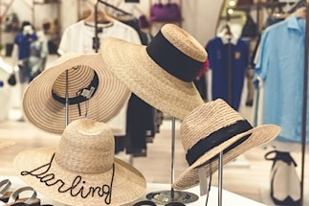
Sometimes, when a display involves a collection of items stacked on a shelf or placed in a row, it’s easy to wander past it. Multidimensional displays focus the eyes on specific products. It can be one item that entices, but complementing items nearby can add more intrigue. Take the hats in this photo. If they were stacked up on a wall they would be easy to miss. But using hat displays highlights them and opens up space to bring more items to the area.
7. Add Pops of Color
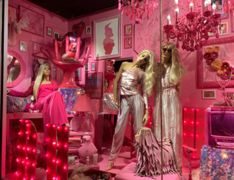
There’s no question that color has power. Within the first 90 seconds of seeing an advertisement, a customer makes a subconscious judgment about it. Therefore, it pays to learn color psychology when it comes to retail merchandising. Did you know that red can stir strong emotion? Or that yellow exudes warmth and optimism? And that blue is all about strength and dependability? Sometimes it’s a case of emphasizing one color you already have and going for a monochromatic scheme. Other times, a pop of vibrant color in a simple acrylic riser will do the trick, too.
There’s no question that color has power. Within the first 90 seconds of seeing an advertisement, a customer makes a subconscious judgment about it. Therefore, it pays to learn color psychology when it comes to retail merchandising. Did you know that red can stir strong emotion? Or that yellow exudes warmth and optimism? And that blue is all about strength and dependability? Sometimes it’s a case of emphasizing one color you already have and going for a monochromatic scheme. Other times, a pop of vibrant color in a simple acrylic riser will do the trick, too.
8. Products in Action
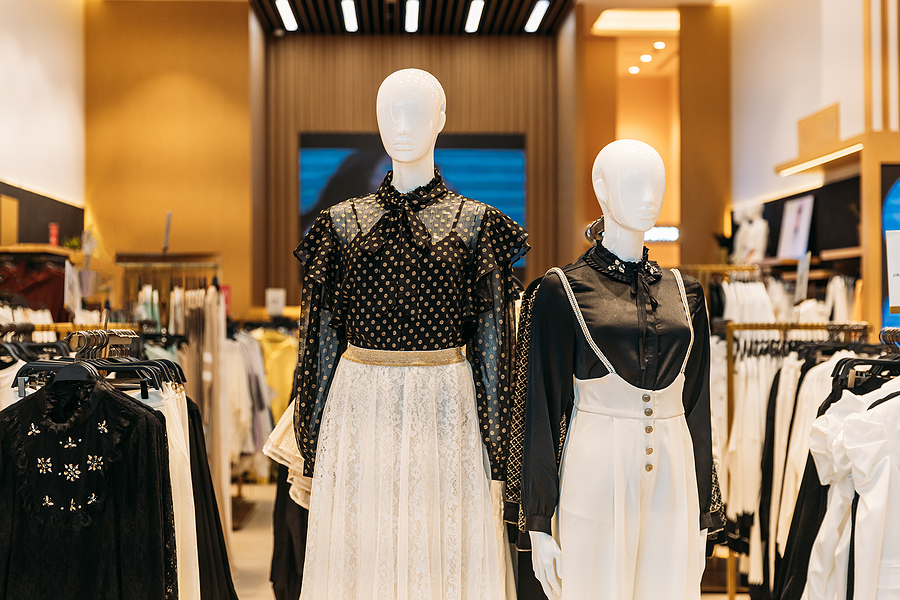
It’s always great for customers to see your products perform. A buyer can’t visualize bed sheets when they’re stuffed into a package. And flashing the unique colors inside of that fancy blazer can’t be done if it’s folded up. Whether it’s showcasing clothes, bedroom linens, or cologne, give your customers an opportunity to see your product perform.
9. Create a Hotspot
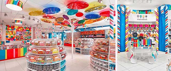
A hotspot involves creating a visually noticeable place where you want your customers to go. It’s not uncommon to use banner signage at a store entrance to guide them to the space.
Once they arrive at the hotspot, you’ll need to impress your customers. A hotspot doesn’t usually highlight just one item but is rather focused on a theme. This could be the Halloween headquarters, snowboard central, or the beautifully made bed in a bedroom arrangement. Ultimately, it’s the display that has everything you need for a topic or occasion, and it can even involve multiple displays working together. Also, remember to cross-merchandise to maximize sales from your hotspot.
10. Create memorable window displays to increase foot traffic
A customer’s in-store journey starts with discovering a product or idea. After that, it becomes a journey of comparing options before a sale. To kick-start the sales process, you need to get your customers in the door, first, and a can’t-miss intriguing window display does just that.
Creative and imaginative window displays embrace a theme, whether that would be summer camping season, autumn decor, or graduation. However, it’s important to still be authentic to both your brand as that’s what makes the display memorable.
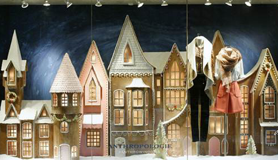
That’s the reason holiday displays are so popular. Some don’t even have a single product in them, but their ability to celebrate a subject is what brings people in. This under-stated Anthropologie display is an example of how to capture the vibe of your brand, the season, and even drop a hint of product into the mix as well.
11. Get the most out of point-of-purchase displays
In most stores, point-of-purchase (POP) displays tend to be the real eye-catchers. They are most often the reason your customers stop, browse, and spend more time in your store. An effective POP display often has vibrant colors; some may also embrace surprising shapes or sizes.
Keep a few basics in mind. First, you don’t want a POP display to be so oversized that it impedes traffic flow; second, it still needs to be clean, neat, and easy to browse; and third, make sure to put bright packages or popular items at eye level.
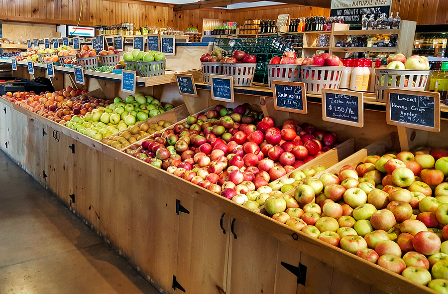
You also shouldn’t overlook the power of more subtle displays either. For example, a cedar barrel wooden display or a basket display can break up a lot of colorful, vibrant pieces. Something as simple as a wooden crate or barrel sends the message that there’s a lot inside and that’s enough to stir some people’s curiosity and make them want to sift through the products.
Conclusion
There are many general retail merchandising guidelines out there, but don’t forget to let your creativity run wild and have a little fun. You never know when you might stumble across the perfect display idea. Contact us to order customizable visual merchandising displays for your business’s specific needs today!

