Today, the customer experience retailers provide is one of the biggest factors that determines which brands will sink and which will swim. With that being said, in terms of retail customer experience, visual merchandising is everything. Effectively leveraging visual merchandising in your brick-and-mortar will help draw customers into boost retail sales, while helping provide a positive customer experience that keeps them coming back.
With this in mind, we’re exploring some of the key elements that go into successful visual merchandising efforts to help you boost traffic and positively impact your bottom line. Take a look:

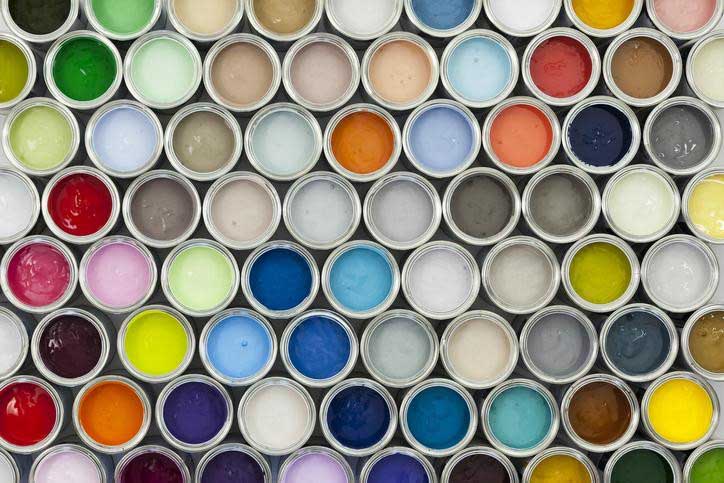
Color is everything when it comes to making a lasting impression. Certain colors can evoke specific emotions, which when used strategically, can help you drive home your business goals and increase your revenue. Consider the ideal customer experience you’re trying to provide for your customers. From there, think about the kind of emotion you want that experience to evoke. Do you want your customers to feel energized, happy, or confident? For example, light yellow can evoke feelings of happiness by reminding buyers of the sun and summer. Darker shades can bring a feeling of luxury and class to your display.
Applying this concept in your visual merchandising efforts can go a long way toward driving better revenue. Retail displays come in a wide array of colors, meaning the sky’s the limit when it comes to making a statement with the right hues.
[wbcr_snippet id=”734″]
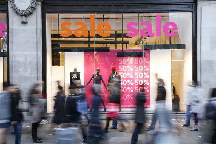
Colors, such as red, blue, and yellow, can all evoke different emotions, but what about neutrals? Don’t rule out eggshell beige, white, and black. These hues are essential for driving foot traffic to certain areas of your store and can be used to focus consumer attention on specific products. Think of placing your more colorful products on a neutral display to make them “pop” to your customers. Neutrals make for the perfect backdrop to eye-catching sale items.
Matching Space and Signage

Above almost everything else, consumers want one thing…convenience. They want to be able to navigate a store quickly and find the products that align with their needs and interests. Knowing this, the usage of retail signage can play a big part in the impact of your visual merchandising. By matching your space and signage, you can create a cohesive look within your retail space, while bolstering your brand.
Your in-store signage should always be clean, concise, and above all else, informative. Signage should be easy to understand and customers navigate your storefront easily. If your store entrance is difficult to find, don’t hesitate to use colorful, concise signage outdoors to point your customers in the right direction. Additionally, it can help to match your signage placement with your store design and layout.
Lighting

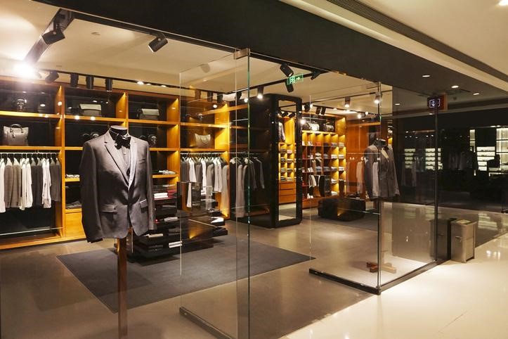
If there’s one thing that can drain your visual merchandising efforts, it’s poor lighting. Storefront lighting is just as essential as color when it comes to drawing the attention of your customers. The right lighting can not only highlight certain areas of your store that you want to drive traffic to, but also showcase specific products and helps evoke emotion and aesthetic crucial to positive customer experience.
With this in mind, consider leveraging fixtures like lighted pedestals or display cases to draw attention to specific products that drive the most revenue. Subsequently, consider how lighting impacts your storefront and its overall aesthetic. Additionally, lighting can be used to place emphasis on certain areas across your storefront, helping subliminally direct traffic to high-value areas.
Retail Display Aesthetic

The way you arrange your point-of-purchase displays is everything when it comes to sustaining your bottom line. Those last-minute, impulse buys customers make before checkout can make a big difference when it comes to boosting your revenue and increasing your bottom line.
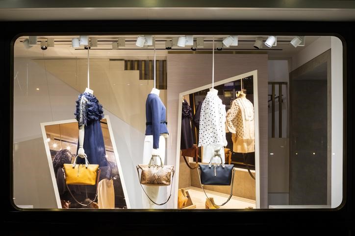
As you look to arrange your POP displays, think about creative ways you can leverage elements like color and lighting to help your products stand out and capture the attention of shoppers just before they check out. POP displays should also be at eye level so that they can be viewed easily by passerby. Finally, don’t forget that these displays should always be created to evoke a positive emotional response.
Whether you’re new to visual merchandising or you’re looking to improve your existing strategy, taking all of these factors into account can help you create a memorable experience for your customers.

