The fine art of organizing a retail space involves a lot of strategic thinking. Retailers know that clean and attractive aesthetics only get you so far. Understanding your buyer’s journey inside the store and what motivates him or her to come to your store in the first place are important factors to consider. All of this information can help you make the best decisions when it comes to product placement.
Some retailers work with product manufacturers who are willing to pay to have their products placed in certain areas of their store. In fact, companies spent more than $11 billion on product placement in 2019, according to Statista. Whether companies are lobbying hard for your premium shelf space or not, here are five time-tested product placement tricks that can help you.
Trick #1: Place the essentials in the back
Many times, essentials such as milk and eggs are the reason a customer comes to your store. Place essentials at the back of your shop so your customer can travel through other sections of your environment and see many other items on his or her brick-and-mortar journey. About two-thirds of purchase decisions are made in the store, and only one-third outside of it. This time-tested product placement trick increases the chances of your customer making additional buying decisions inside the store, driving more revenue.
You don’t need to be a grocery store owner to apply this trick. Any retailer can do it. It’s all about knowing which items attract your customers into your store in the first place, then make sure they are placed in the back. As you accumulate more shopper data, and as this trick helps to increase the time your customers spend inside your store, you can weave in other unique display pieces to capture their attention and spur even more purchasing activity.
Trick #2: Movers get eye-level treatment
Product manufacturers would love to have their products placed at eye-level on your shelves, but save that precious real estate for the products you know will move. As was mentioned in the first trick, popular items bring people into your store. But you also don’t want to frustrate a customer by placing popular items in hard-to-find areas – keep them at eye level. That doesn’t mean you can’t also get your customer’s attention with nearby displays that have complementary pieces or take advantage of cross-merchandising opportunities. Just don’t bury the good stuff.
Trick #3: Treats near the door

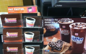
There’s a reason grocery stores have been placing sweet treats near the checkout for decades. It’s important to make sure that items near your register appeal to emotion. Think: quick grabs your customers “need” out of impulse or could have maybe forgotten on their shopping journey. Yes, candy is the obvious one, but travel-size items, gift cards (like those in the gift card holders pictured), accessories, drinks, toys, and—all the rage at the checkout line these days—antibacterial wipes! These are products that appeal to your customer’s emotional needs.
Trick #4: Don’t forget to rotate items
 Retail display and store layout strategies involve movement. Yes, we ultimately want products to move out the door, but while they’re still inside your store, their location needs to be refreshed from time to time.
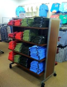
Try catchy stand-alone displays in different areas of the sales floor. If your data shows some products are being purchased together, consider moving them closer to each other. If you sell shoes, keep them moving around as seasons change, and as certain ones become hot sellers, consider them for the front of the store and in window displays. If you sell clothes, try eye-catching and colorful pieces near
the front of the store or check-out. In fact, regardless of what type of store you have, it’s always a good idea to test a variety of different items on front-of-store displays to see how they perform.
Trick #5: Keep displays small, simple
 When there are too many items to choose from in one area, or on a single display, a customer can easily become overwhelmed. Having a few items on simple display pedestals, for example, allows a person to examine all of the items thoroughly and ask questions, if they have any.
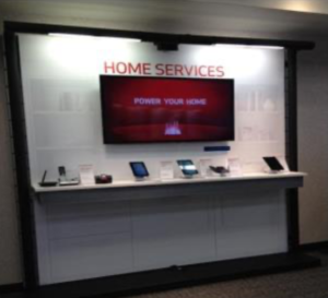
Cell phone stores, for example, are often set up so that customers can quickly drift between a few small displays, and learn about a variety of different phones or accessories. By not cluttering a display, customers can take in all the information and ask questions, which gets sales conversations started. In these stores, the display pieces are also a part of the educational journey for customers. The cell phone store display strategy doesn’t need to be followed by everyone, but it can help you make a mental note of whether a display or shelf enhances the buyer’s journey, or if it’s crowded, complicates or frustrates the in-store experience.
Conclusion
Effective product placement involves some trial and error, and as you learn more about your customers and try different approaches, you’ll find other tricks that work for your store, specifically. If you need guidance, work with one of our consultants to help you make the best merchandising and product placement decisions possible.

