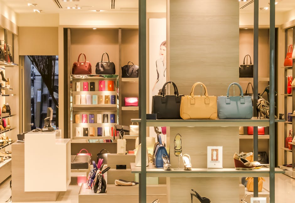
Point-of-purchase (POP) designs are a critical component within the advertising process. Through the correct display, companies can connect with customers and encourage them to purchase specific products. An advertising image might say a thousand words, but a perfectly designed POP display can inspire customers to buy a product almost instantly. Here’s how…

Custom POP displays should use materials with bright colors
Creating an eye-catching display requires bright, vibrant colors. Remember that each color is associated with a specific emotional response; as such, you should choose wisely. Avoid placing colors that clash, rather than complement, with one another. For example, you might be tempted to use materials using a bright yellow background with a blue font; this color combination is certainly eye-catching, however the result will be too garish to the viewer. Instead choose vibrant colors that help tell the story of the product. For example, if the POP display is selling sunscreen, then you might use green, blue, white and yellow materials to remind customers of the beach.
Make messages short and sweet
Brevity is key in creating a powerful POP display. With simple language you should succinctly tell customers how they will benefit from the product. To continue with our sunscreen example, you might say, “Enjoy the sun and avoid the burn!” Short, sweet and reminds customers that they really do need the product if they want to spend time in the great outdoors.
[wbcr_snippet id=”1090″]
Display signs at eye level
A POP design is only as good as the manner with which it can be read. In other words, if your display’s call to action isn’t placed at eye level, then your customers are going to breeze past the display. Make it easier, not harder, for the customer to find, grab and buy your products. Remember that a POP display should catch shoppers’ attention; this is best done when the display is at their eye level and designed with easy-to-reach products.
Custom POP displays should showcase the products
Bigger is not always better and less is sometimes more. A great POP design will display products so that they are visible and easily accessible to all customers. Bold signage will entice the customer to come to and stop at the display. With this in mind, let the product’s packaging tell the rest of the story. I.e., Remember tip No. 2: “make messages short and sweet” so that the consumer can recognize the product’s benefit and buy it without a second thought.
Create a positive emotional response
Whether shoppers are buying sunscreen or purchasing stocking stuffers for their children, buying is an emotional journey. Products with great packaging will elicit a positive emotional response. An effective POP design should trigger the first emotional reaction, so that the consumer will pick up the product, read the packaging and purchase.
Point of Purchase (POP) Designs Should be Results-Driven
A properly designed POP display will effectively persuade customers to buy the product. This motivation is enhanced by the above five steps, as well as the understanding that a POP display can open the door to future advertising efforts. In this manner, POP displays should be created to support previous advertising efforts and deliver an immediate purchase response, while simultaneously leaving a lasting impression with the customer.
Need help with your store’s custom POP displays? Contact shopPOPdisplays today!

