In today’s increasingly competitive retail environment, visual merchandisers and marketers must be vigilant when seeking ways to gain an edge on their competitors. Retail signage is one clear way to gain this advantage. Retail signage helps attract customers into a store, and further encourages purchases once customers enter.
However, visual merchandisers need to design signage with intent. Otherwise, signage may miss the mark and ultimately become ineffective. Let’s go over a few recommendations and strategies to create the most effective signage for your store.

Utilize Retail Signage on the Store’s Exterior
Exterior signage should be designed to grab the attention of passersby. It’s important that your store’s outside-facing messaging is bold and conspicuous while still adhering to your classic brand guidelines. This can take place in many forms – maybe it’s a certain phrase hanging from the window display, a mural painted on the side of the building, or a backdrop for existing retail displays.
Make sure this aligns with the general market in your store’s area. Exterior signage should pique the interest of a certain demographic within your store’s geographical area. As a result, marketers and visual merchandisers should always consider what the local’s tastes are before engaging, and should never have a one-size-fits-all strategy for exterior signage. However, be careful when playing off of regional reputations and stereotypes. If executed well, this signage will resonate with customers in a funny way. If executed poorly, it could annoy or even offend a local community.
Pay Close Attention to Typography
The average business owner may underestimate the value of choosing the right font or typography style. However, a visual merchandiser wouldn’t be able to stress its importance enough. Typography helps give your store a certain identity – a trademarked font makes the brand recognizable, a regal font communicates luxury, and a classic font radiates traditional values. The right style for your text-based signage can give your customers the right preconceived notions about what your brand is, and who your products are for.
When choosing the right style of typography, make sure your font is simple to read. According to design best practices, only two font families should be used in a single sign. If two font styles are used, one should be serif and one should be sans-serif. Additionally, any “elegant” fonts should still resemble the Latin alphabet in countries that use the Latin alphabet. Potential customers aren’t likely to stop and take the time to decipher and interpret sloppy signage – and they’re far less likely to buy a product after being exposed to that signage.
[wbcr_snippet id=”737″]
Good Retail Signage Guides Customers
The best retail signage tells customers what they’re looking at and why they should be interested, all within a single glance. It’s similar to headlines in a newspaper – they need to be succinct, right to the point, and encourage further activity.
Retail signage can either be “purpose-built” or “persuasive.” This distinction is crucial to ensuring that the signage is effective. Purpose-built signs direct consumers around your store layout, such as indicating where accessories are located within the store. These signs are often straight to the point, and designed with utility in mind first, and branding second. On the other hand, persuasive signs focus on projecting your brand image while encouraging a sale. Persuasive signs often are fun, creative, and may utilize wordplay or humor.
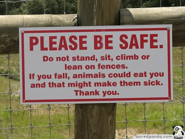
In the same vein, avoid using negative signage unless absolutely necessary. For example, a “DO NOT TOUCH” sign, even if placed with the best intentions, may come across as aggressive or unreasonable. This could discourage purchases or damage attempts at building brand loyalty. If a negative sign is necessary, try delivering the message in a lighthearted way. For example, consider this sign that discourages zoo visitors from improperly using fences:

Don’t Rely Solely on Text
Although not immediately obvious, text isn’t crucial to creating great signage. Visuals can help customers derive a lot of information at once – the classic saying “a picture is worth a thousand words” should come to mind! In fact, it’s been shown that people process visuals significantly faster than they process text. If it’s difficult for your store to communicate a message with words, using graphics with your signage may prove to be helpful.
If your store is located in a multicultural area, or an area that attracts a lot of tourists, visual signage is almost a necessity. Images are one of the most effective ways to overcome a language barrier, which is a vital consideration for many retailers.
Test & Maintain Your Retail Signage
When you’re hanging up signage as part of a window display, it may look perfect from the sidewalk. However, that doesn’t mean that people will notice your signage when they’re driving by. Be sure to test your signage from a variety of potential viewpoints and angles, and solicit opinions from friends or employees about the best possible options.
If you have multiple locations, engage in some A/B testing. Simply design two slightly different signs, and place them in a similar location. The sign that drove the most foot traffic and sales is the more effective option, and should be tested in more locations.
Once your store has created effective signage, be sure to maintain its integrity over time. If the sign is backlit, make sure none of the lightbulbs are burnt out or flickering. Make sure any painted signage isn’t chipping, and check your paper or fabric-based signage for tears. If you’re looking for easy to maintain retail signage, consider using signs built from acrylic plastic, since these tend to be more durable than other kinds of materials.
Final Thoughts
Signage is an important part of attracting customers into your store, and encouraging to make purchases once they’re in the store. While visual merchandisers have a lot to consider when designing and placing retail signage, the deliberation is almost always worth it. With effective signage, you can drive more action and interest towards your star products, all while building brand value.
Looking for signage to help drive sales and foot traffic? Take a look at our assortment of retail signage options, or contact us today.

