Educators are always thinking of new ways to connect with students. One is through thoughtful and creative classroom design. Student-centered learning environments are welcoming and, when done well, serve all types of learners.
Successful classroom design requires a little outside-the-box thinking and experimentation. There isn’t really one set strategy that works for every room. Some teachers may even rearrange their classes a few times during the course of a school year to keep things fresh and perk up students who’ve settled into a pattern.
Here are six creative organization tips you can use to spruce up your space and direct attention effectively.
1. Whiteboard up front? Maybe not.
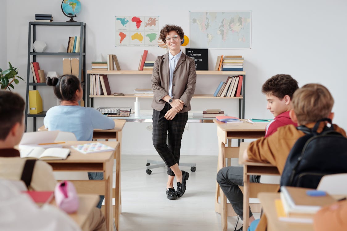
Many of us have grown up seeing the same things at the front of the class—the instructor in front of a whiteboard or chalkboard. As a teacher, you might ask yourself: Does the whiteboard really need to be dead center? Arranging the learning space in a different way can change the mood in the room and boost student attention levels.

Bookshelves, displays, posters or even blank walls—just something different— can encourage students to keep their focus on you. Placing the whiteboard or chalkboard to the right or left helps draw students’ attention as you walk over to write down key points, and it forces them to shift their eyes and bodies instead of staying in one position the entire time.
Conventional items such as a podium, mobile laptop cart and projector board for digital presentations can remain in place; the former is completely unobtrusive, and the latter can be turned off.
2. Create zones.
Don’t be afraid to rethink traditional desk rows, either. Some classroom environments are much more inviting with tables that sit several students or clusters of desks that accomplish the same thing. When student teams or conversations are essential to the subject at hand, this type of arrangement also invites participation.
If you are lucky enough to have extra space, consider creating a lounge area for students to read in their downtime after their work is done. Some of today’s classrooms have even embraced a Starbuck’s feel with a variety of seating options that allow students to responsibly choose where they work. Mixing learning zones with group spaces freshens up the room, gives student the freedom to choose the learning area that best suits them, and contributes to a positive culture overall.
3. Edit your desk.
When it comes to classroom design, everything’s in play—including your desk. Most teachers probably appreciate a private space for themselves and their belongings, but examine the stuff you keep in and on your desk and ask yourself if they can be placed elsewhere. Items you don’t use every day certainly can if you have a long row of cabinets or ample shelves or counter space. If you want to go all out and eliminate a large teacher’s desk you could even use a locking filing cabinet for personal items. All that extra space can become a new learning zone or simply give your students more space in crowded classrooms.
4. Use walls to dictate the vibe.
Walls are more than areas to communicate due dates or hang posters with inspirational sayings. They can be used to motivate, spotlight or set a mood. For instance, publishing boards that tout student successes are valuable motivational tools. Pops of color have been proven to adjust the mood in the room and can be updated easily as the seasons change (or even on a whim). If you want to raise the participation level in the classroom, considering bringing in reds, oranges and yellows for a vibrant punch. To provide a calm space for contemplation, study or relaxation, choose soothing blues and greens. And lower the clutter factor; an item that is placed apart from others draws more attention.
5. Get the most out of trays and bins.
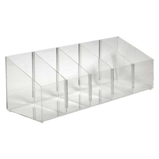
Writing utensils, scissors and other handhelds should be corralled in trays to keep everyone organized. Stacked near the door, they’re great for parking students’ attention-sucking mobile devices when they’re not using them to do actual coursework, too. Clear acrylic bins allow you to see all of the items at a glance, and they’re handy on tables, counters, desks and areas where paper assignments are turned in. Larger dump bins with removable dividers are roomier and can be adjusted to accommodate items of different sizes.
6. Use barriers for social distancing.
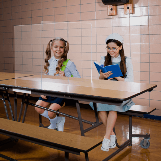
Depending on district policy, you may need to use sneeze guards or acrylic barriers to keep your students socially distanced. Whether floor-mounted or built for desktop or tabletop use, they come in almost infinite shapes and sizes, including barriers such as the one depicted here that are meant to shield several people at once.
There are a number of ways sneeze guards can be used and organized in an unobtrusive manner.
Ideas and help are everywhere.
If you’re having a hard time tackling a specific organization or layout problem, remember that teachers love to share! There is a wealth of info on social media to spur your imagination—one of my pandemic favorites is the teachers who turned every one of their first-graders’ desks into jeeps to make the desktop barriers less weird.
The pros at shopPOPdisplays can assist too. We’ve designed environments for thousands of school settings. Let us know how we can help!


