With the influence of eCommerce growing, brick-and-mortar stores need to capitalize on every potential customer entering their store. That’s why visual merchandising has become such a critical part of the in-store experience in recent years. It vastly improves the customer experience, encouraging repeat purchases. These displays also highlight the features and benefits of the products that stores would like to promote, improving sales of specific items.

Visual merchandising is a catchall term that manifests itself via store layouts, window displays, point-of-purchase displays, and more. These can reinforce brand strategy and brand characteristics, all while educating customers and encouraging them to make purchasing decisions via subtle suggestions. Without an effective visual merchandising strategy, your organization could risk a loss of customer loyalty and depleting or stagnating sales.
What Attracts Consumers to Visual Merchandise
By better understanding customer behavior, your visual merchandising efforts will be improved. In general, customers like to be enticed with creative displays that align with your brand. Try to base your displays around a theme using unique displays to catch the eye. For example, storing products in or on top of a wooden barrel could catch a consumer’s eye and provide a unique theme to the store, or section of a store. In addition to barrels, products like acrylic pedestal risers, acrylic shelf risers, and acrylic blocks can create visual interest by arranging products at differing heights, while drawing attention to key merchandise.
Don’t underestimate the power of signage in a store environment. Proper signage informs customers of brand messages or gives a clear call to action that encourages customers to follow the intended flow of a store. Signage allows customers to explore the store at their own pace without interruption from employees that take them out of a shopping mindset—ultimately making them more price sensitive.
[wbcr_snippet id=”1090″]
Overall, visual merchandising should be used to set a theme for a store and facilitate a more interesting shopping experience with more purchases.
The 6 Ingredients of Successful Visual Merchandising
In order to have a successful visual merchandising initiative, there are six main traits that should be considered. By keeping these in mind, your store should become more attractive to shoppers:
Eye-catching Entrances
First impressions are everything. Unfortunately, research has shown that shoppers can be oblivious to in-store displays within the first fifteen feet of the store entrance. That’s why it is important for retailers to focus on creating beautiful window displays, which can grab attention and advertise star products before consumers even enter the store. To do this, be sure to use striking, emotion-provoking colors with featured products being displayed at eye-level to passersby.
While customers are unlikely to notice or purchase products near the entrance of the store, don’t ignore the potential of this area to set the tone of the entire store. For example, imagine the average grocery store. More often than not, shoppers are greeted by an array of blooming, beautiful flowers right by the front entrance. This isn’t necessarily because supermarkets are trying to compete with local florists. Instead, visual merchandisers intend to give a pleasant display of freshness before consumers head to the produce department, which is usually adjacent to the floral displays. This increases the grocery store’s general perception of quality. This logic can be extended to almost any brick-and-mortar location. While a display next to the door will not sell many products, setting the correct tone will boost sales deeper into the store’s layout.
Use Strategic Store Layouts
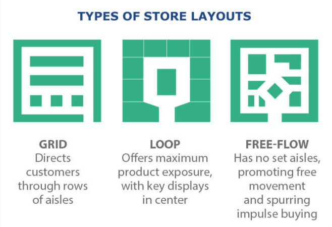
Store layouts have a passive psychological impact on all shoppers. By designing your store around certain floor plans, stores can influence the paths that most consumers follow. Keep in mind that more often than not, customers turn right when entering a store and will typically peruse products along the path of least resistance. Here are a few examples of effective store layouts:
Straight/Grid Floor Plan: This is the most economical choice for stores, as it conserves floor and wall space by placing product displays parallel to store walls. This model is often used in grocery stores as well as book stores.
Loop Floor Plan: Customers are surrounded by product displays on the outer wall of the store, which helps spur buying decisions. Creative displays are regulated to the center of the store, helping to reinforce the store’s theme. This layout creates a set pathway for customers to travel along. This is the most popular plan for apparel and homeware stores.
Free Flow Plan: Product displays and creative fixtures are arranged at angles, encouraging customers to slow down and appreciate products. This plan is often utilized in boutiques and upscale stores.

Break Up Store Layouts with “Outposts”
Outposts are displays that are positioned near or within aisles. These outposts disrupt the store layout and can make shoppers consider purchasing a product that they may have otherwise ignored. This makes them much more susceptible to impulse purchases, especially if these outposts are placed in a main aisle. A great way to display these items is with dump bins and basket displays along browsing paths. These displays should blend in with the rest of the store’s decor, while the products on top of them should be placed at eye level to become more conspicuous.
Use Color to Appeal to Brand and Consumers
One way that customers are attracted to displays is due to color contrasts with other aspects of the store environment. Customers are also drawn to bright, colorful displays that are starkly contrasted by the color elements of the majority of the store. When choosing colors to command the attention of the shoppers while creating effective messaging, consider some traits of color psychology:
-
- Yellow: Yellow sends a message of optimism and youth. When used correctly, it can entice window shoppers into making impulse purchases. On the other hand, too much yellow is overwhelming and creates anxiety in shoppers, encouraging them to leave.
-
- Orange: Orange is a more aggressive variety of yellow, without being as demanding as red. It grabs the customer’s attention and encourages enthusiasm. This can facilitate impulse purchases.
-
- Blue: Blue is a color that evokes trust. It’s no coincidence that many banks, insurance companies, and organizations like the Better Business Bureau like to use blue. It attracts traditionally-minded buyers while giving off maturity and safety.
-
- Black: Black is a powerful and sleek color. For this reason, it’s often used to promote luxury products. Black also is visually appealing with a very wide range of colors, and can be used to play up contrasts.
-
- Green: Green is a relaxing color that allows shoppers to let their guard down. It can also be used to give off a nature-friendly or budget-friendly impression, depending on the theme of the store.
Encourage Impulse Sales through Product Placement
Good visual merchandising should encourage last-minute sales since only one-third of purchases are planned. Visual merchandisers can help drive these last-minute sales through the following methods:
Grouping Products Together: Visual merchandisers can group similar items together to help encourage sales. This can be done through natural relation, which groups similar products together. For example A laptop, a laptop case, and charging cable or a necklace display and earring display. Products can also be grouped together via collective behavior. These may be products that don’t appear to have a natural relation to each other, but based on research, are often bought together. For example outdoor patio furniture and pool supplies.
Considering Product Placement in Relationship to Store Layout: The perimeter of the store generally receives the highest foot traffic, since shoppers, typically don’t go in and out of every aisle. Using promotional items in the end caps of these aisles can further drive sales and encourage browsing. Additionally, shoppers tend to walk toward the right wall of a store first. Include common & affordable items here. Be aware that new customers will check here to get a sense of pricing for your store.
Keep Consumers in the Store Longer: Items such as bread and eggs are often placed at the back of the store to encourage consumers to browse. Move everyday items(also known as destination items) toward the back. That will allow your consumers to explore your offerings as they grab them.
Update Visual Merchandising with Seasons
Keeping your visual merchandising efforts up-to-date with the seasons keeps your retail displays fresh while encouraging customers to make more purchases. This is because the recurring, yet transient, nature of seasons gives sentimental feelings to shoppers. When harnessed correctly, these sentimental feelings encourage impulse purchases. For this reason, it is advised that stores put any seasonally focused items inconspicuous locations—like in line at the register—so they will be noticed, and sell quickly as a result. Although a change in season should inspire massive change in your store’s visual displays on a monthly basis. Typically, displays should begin changing to match the next season one or two months before it begins, giving shoppers plenty of time to prepare for the changing season. For instance, winter holiday displays should begin being set up as early as October, and summer displays should be arranged in early May.
Final Thoughts
Using the right product displays is critical for effective visual merchandising. By executing visual merchandising initiatives properly, your store can improve its customer experience, and ultimately become more competitive in the retail marketplace. Curious about which structures can help advance your store’s visual merchandising efforts? Contact our team to see how our extensive selection of display products can transform your store.

