In a world where shoppers are dependent on the convenience of purchasing goods online, it can be challenging to drive customers into your brick-and-mortar storefront. With this in mind, one of the common pain points for retailers trying to drive in-store traffic comes down to the display efforts they use to entice consumers. So, how can retailers better leverage their displays to catch the attention of consumers and get them through the door? In this article, we explore what factors and approaches that should be considered when constructing retail displays in terms of product placement and visual merchandising. To get back to the basics, visual merchandising is the process of planning out your store layout and pairing this plan with the right displays to maximize ROI and boost sales. Additionally, we cover tips and tricks you can use in your display efforts to appeal to your customer base and encourage purchases.
Display Placements
Display placements play a vital role in your customer experience. Having a well thought out floor layout will ensure that you can place all your products in locations that give the most promising return on a sale. Listed below are a few clever visual merchandising strategies that will allow your goods to be noticed.
Build a Path of Interest
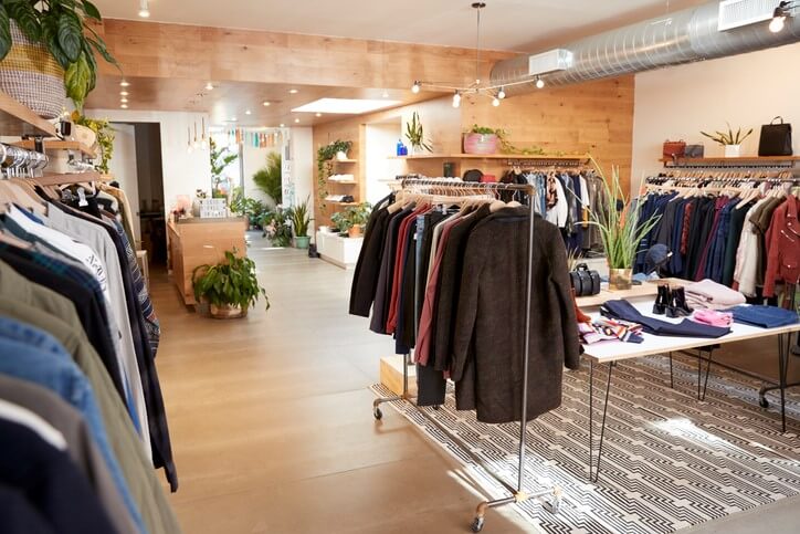
Placing your top-selling products at the back of your shop will force customers to walk past prime merchandising areas, introducing them to new items and encouraging them to expand their purchase. It’s likely that your customers will pick up a thing or two on their way to what they initially set out to buy.
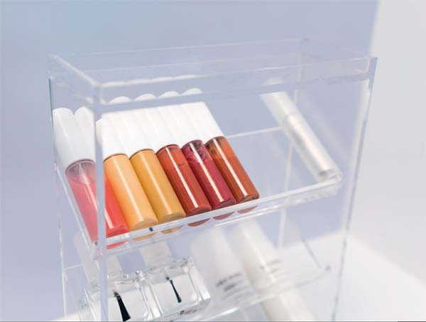
To create effective paths of interest, consider using acrylic risers or basket displays to prop up or stock inventory and place these fixtures strategically throughout consumer’s browsing baths. Using an acrylic shelf riser to prop up smaller merchandise can help them stand out amidst the shuffle. Clear or black acrylic risers are perfect for blending in with your store’s decor without interfering with your style or branding. Using basket displays to organize inventory is also another fun tactic.
[wbcr_snippet id=”734″]
Additionally, compartmentalizing stock inside of different fixtures helps your shop tell a story and helps your consumer smoothly shift their focus; allowing them to experience all your store has to offer without feeling overwhelmed by options.
Place Seasonal or Specialty
If your shop sells seasonal items, it’s always a smart idea to keep them near your registers and checkout lines. Because of their sentimental nature, these items will be perfect-last minute add-on items inside of your customer’s carts. Keeping them near the register will heighten the chances of you selling your seasonal stock, helping you avoid marking items down to make a sale.
8 Ways to Use Displays to Highlight Products
There are several approaches you can use to make your products stand out with the use of eye-catching displays. To help, we’ve listed some of our favorites:
- Place the retail shelving and racks against a painted accent wall to highlight noteworthy merchandise, since people are drawn to bright flashy backgrounds. Put your priority inventory against a loud wall and have your consumers effortlessly flock to it.
- Adjust lighting to accentuate products placed on counter top acrylic mirrors. Acrylic mirrors can give your products the lighting and accents they need to brilliantly shine. Placing lighting strategically above these mirrors can heighten your products luster and appeal.
- Minimize clutter by choosing the right retail display and fixtures to organize your inventory. Using racks, shelves, and even wood barrels for storing items can help declutter your floor space and allow your customers to comfortably browse while accentuating your brand’s unique style.
- Use acrylic displays to make your store feel bigger. Acrylic is clear and transparent, and helps create the illusion of space. If your store exists in tight quarters, the use of acrylic can make it feel less cramped and more comfortable for the consumer to navigate.
- Use color product displays as vivid accents by lining them up against a clean white wall.
- Establish a hierarchy. Experiment with display fixtures of varying heights to help capture your customers interest and boost interest. When choosing the right height, keep the most important products at eye-level.
- Focus on your window displays. The first impression your customer will have to any physical store is at the door. Consider creating a custom display that speaks to your brand for maximum engagement.
- Tell a story with product groupings. Use trays, basket displays, and dump bins to organize and gather certain products while also strategically showcasing how they work together. For instance, if you are a grocer you may want to place chocolate chips in a basket near flour and confectioners’ sugar to present the idea of baking cookies.
Store Design and Layout
When planning your store’s design and layout, remember product placement will direct your customers’ flow and define the message of your branding. There are several ways to shape your floor plan to help encourage sales and create an enjoyable shopping experience for your consumers. Listed below are some popular floor plan layouts that create an exciting customer experience inside your shop’s space:
Grid/Straight Floor Plan
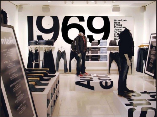
This style is extremely effective for the use of both floor and wall space. Keeping retail fixtures and displays running parallel to walls, it maximizes every inch of available floor, including corners. Most commonly used in grocery stores, this layout works well in toy stores, bookshops, and specialty markets.
Loop Floor Plan:
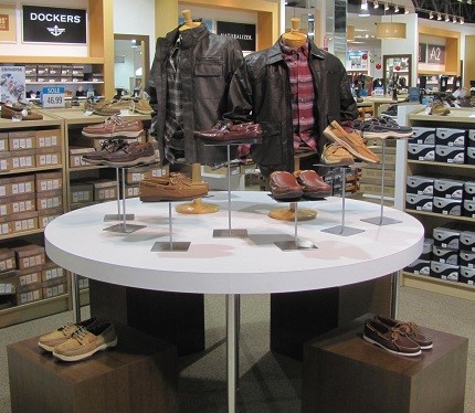
A loop floor plan exposes customers to every item on display. It surrounds customers with product displays on the outer walls and builds creative displays in the center of the store. This layout is popular within apparel stores, home-ware, and specialty products.
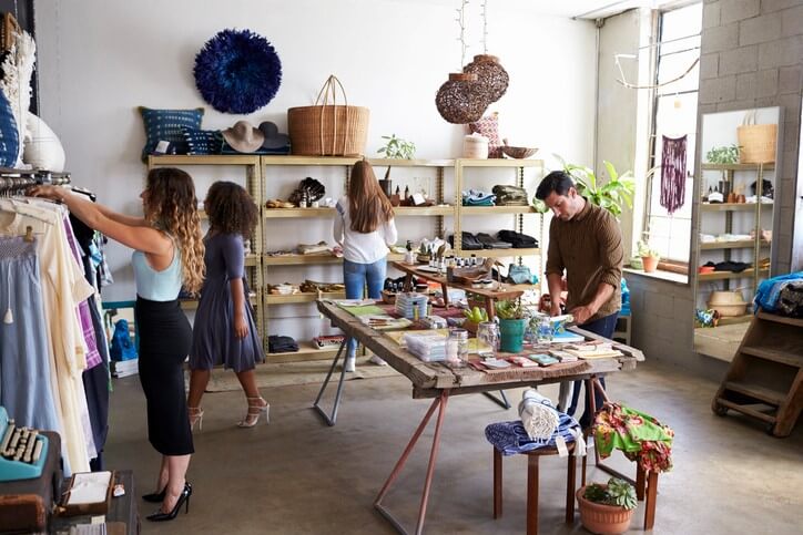
Free Flow Plan:
This floor plan allows for the maximum amount of creativity. Fixtures and displays are placed at angles to encourage shoppers to slow down and to interact with the highlighted products. This plan is perfect for boutiques and upscale stores.
Are you a visual merchandiser or store planner? Contact our team and let us know how we can contribute to building your latest store layout and design.

